Objective + Process:
Create a brand that embodies the personal sensibilities of Ianta Summers (owner) as a successful public affairs aficionado whilst simultaneously conveying warmth, connection, and communication.


Execution + Results:
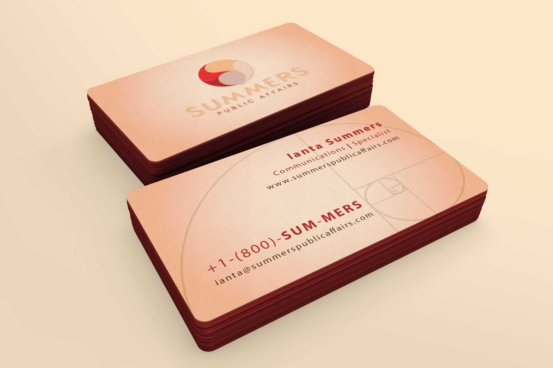
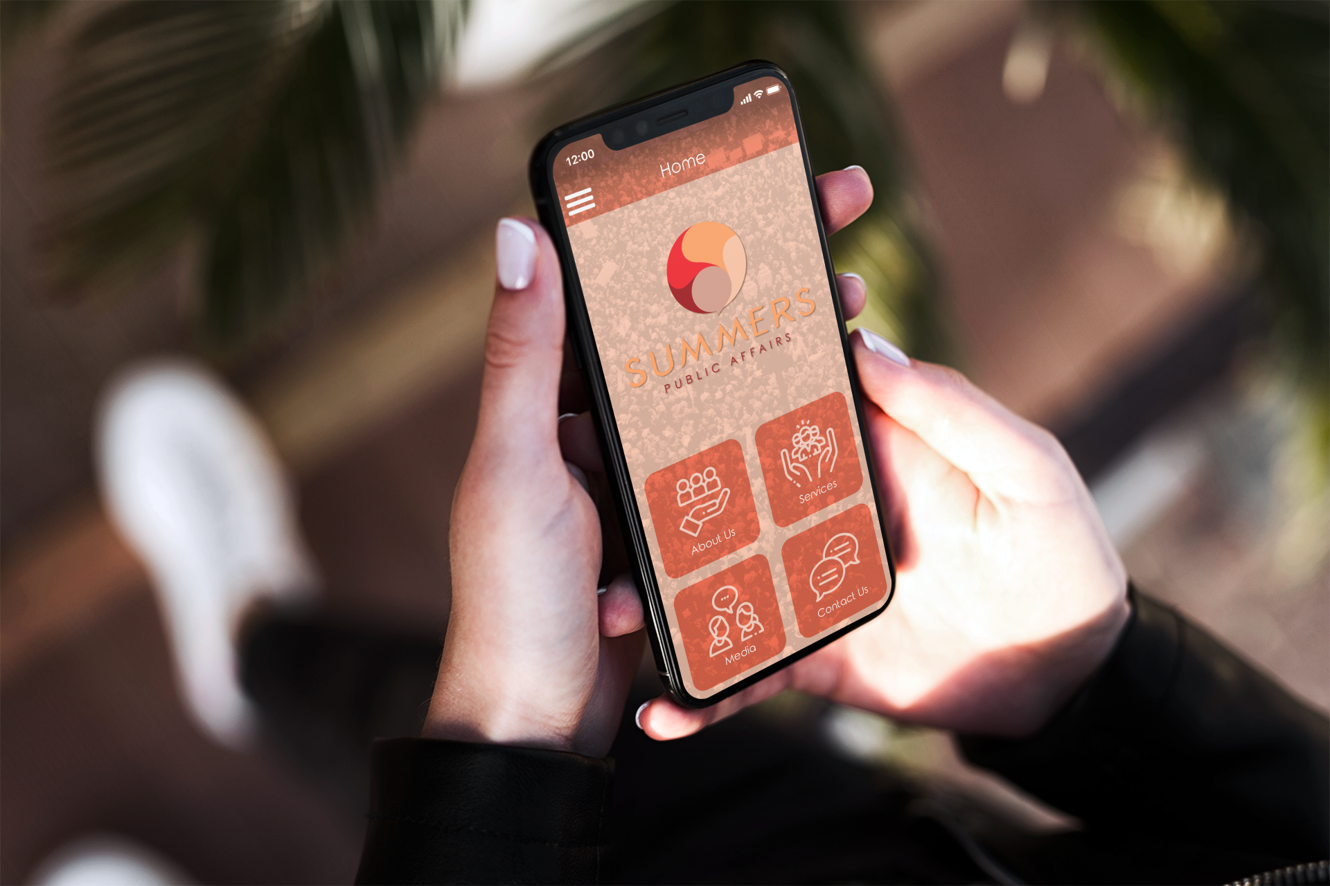
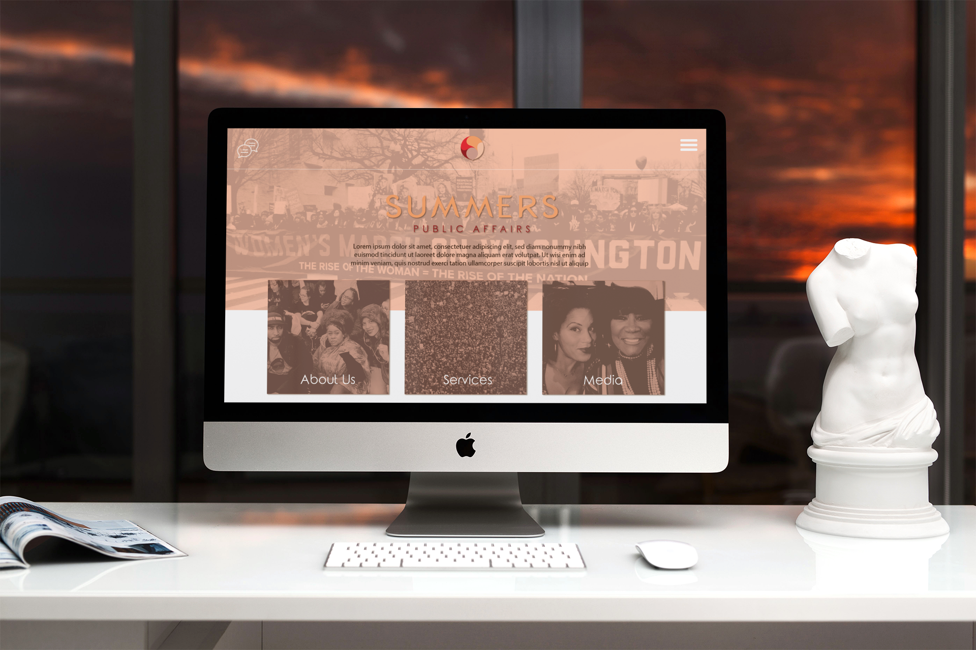
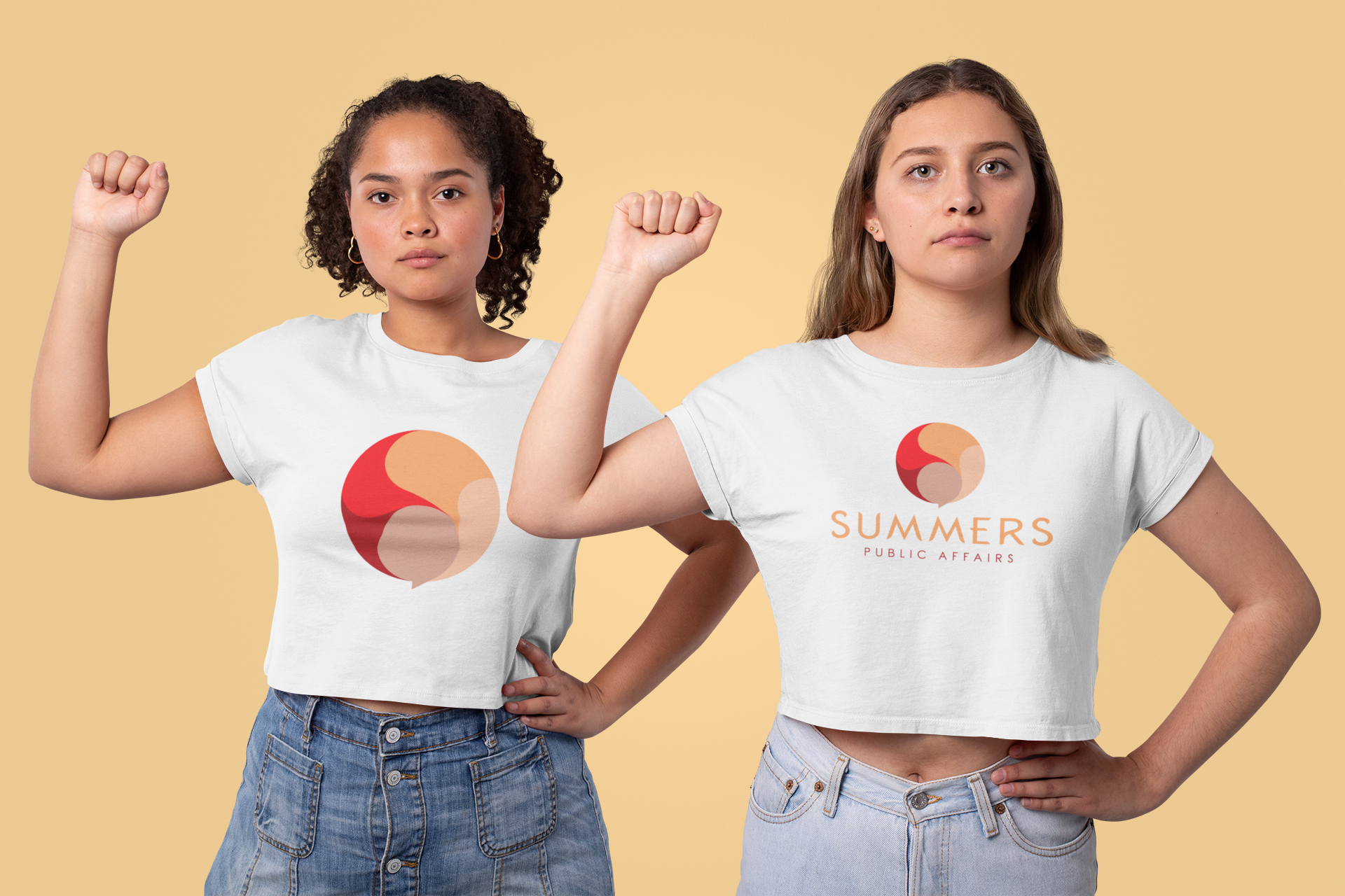
Summers Public Affairs uses a combination logo comprised of a symbol and a custom designed wordmark with a tagline. A creatively designed fold-out brochure was designed using the design elements of the symbol logo throughout in order to provide more information on the company and showcase the successful use of the brand in printed form(s) (i.e:. business cards, mobile application, website, clothing, etc.).


Finalization + Fruition:
As the branding was solidified for the basic necessities (i.e:. logo, business card, brochure), it was needed to illustrate proper usage of the logo package on different branding items and environments to make the overall package take on a true feeling of reality.


Closing + Finale:
Summers Public Affairs is a brand that relies on simplicity to convey its message of being the firm that has a new, powerful yet humble approach to public affairs.
The final outcome conveyed the proud, afro-centric roots of the owner; it illustrated communication very simply and succinctly; And lastly, paid homage to the Summers name itself by creatively incorporating the letter "S" in a subtle way.
The complete branding packaging of the Summers Public Affairs successfully embodies warmth, communication, and accessibility.
